If you read design blogs, follow designers or stylists and don’t live in a cave off the coast of the North Sea then you’ll have heard the news…
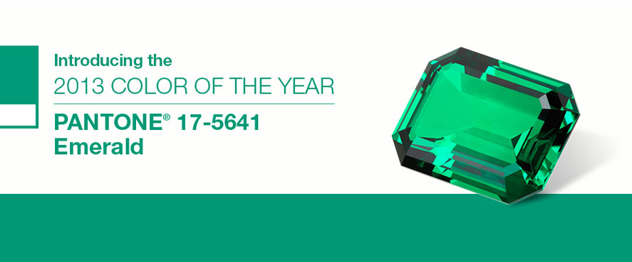
You will have heard that those ‘all-knowing’ people over at Pantone (the international standard for identifying, matching and communicating colours) have declared Emerald’ to be the colour of 2013.
Drum roll please… In all its brilliance, we’re proud to announce the 2013 #ColoroftheYear: bit.ly/11XNy3M, PANTONE 17-5641 Emerald!
— PANTONE (@pantone) December 6, 2012

Sounds very grand doesn’t it? Speaking about emerald, they say:
Lively. Radiant. Lush. A color of elegance and beauty that enhances our sense of well-being, balance and harmony.
And who wouldn’t want some of that in their life?
What does this actually mean? Well it means that the catwalk, high street stores, magazine spreads and homeware shops are likely to be filled with more green emerald than you’ve ever seen.
I haven’t always been a fan of green, emerald or any of their family but as I wrote here, a while back something in me changed and it made the ‘yes’ list.
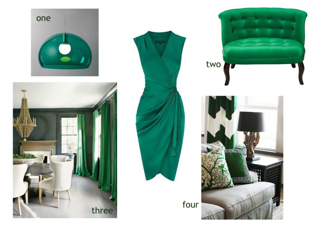
one: Kartell Fly ceiling pendant at John Lewis | two: Velvet love tub from Oliver Bonas | three: beautiful emerald curtains make a statement but can be changed whenever you want | four: accessories with a touch of colour will do the same job and are even easier to switch when the mood takes you.
So, I concur, emerald rocks and it’s a definite yes from me.
I know the people over at Pantone have just let out a huge sigh of relief…. haha.
you can subscribe to this ‘ere blog on bloglovin
see what’s rocking my world on instagram @dbd10
connect on twitter @decorbydelali
peep my pins on pinterest
find me on facebook


